With
my work I think my strengths are the following based on both personal
opinion. As well as feedback from industry professionals and tutors.
- Use of and understanding of Composition. I believe this one is self explanatory, and is probably one of my strongest skills.
- Use of and understanding of colour - this is open to debate but for the most part I believe I usually have quiet strong use of colour. However in a recent feedback session for the Atomhawk work it was pointed out I did not have a cohesive colour scheme that matched my initial thumbnails. I believe this shows I need to not get complacent when planing my colour schemes as it can lead to create lower quality work than I am capable of.
- Understanding of ideation and design principles in order to create various answers and design directions for briefs.
- Communication ability, and a general understanding of my practice as a concept artist.
- Creation of environments to a high standard. I believe at the moment my environments are quite strong, whilst my lighting could use improvement as confirmed by my presentation with Ron from Atomhawk, I feel my environment design and general output for environment designs shows a higher ability level than my other work.
- Strong researching skills as demonstrated in my previous posts showing use of reference. And in my opinion I believe I demonstrate in my presentations of my work that I have thoroughly researched all aspects of my designs.
Again
based on feedback from professionals, my tutors, and my own opinion I
believe these are my weaknesses.
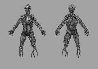
- Lack of preparation for my work sometimes leads to easily avoided mistakes, as an example for the Atomhawk brief the final environment Illustration, 'The Clearing' I should have spent more time making sure my perspective was correct before going into rendering. As well as making sure I had worked out the value grouping before hand. This would of saved a lot of time with the corrections I had to make later on in the process.Moreover with the example in a previous learning outcome I could of created a better designed Shadow creature if I had spent more time in the initial design phase in order to tell earlier the design was not working instead of going straight into rendering.
- Carrying on from the previous point about perspective, I tend to add confusing perspective choices in my work which lead to problems later. This could easily be addressed by spending more time in the initial foundation stages of my work.
- Figure drawing and character design are by far my weakest areas of expertise and they are really holding my work back. I feel I spend so much time struggling with the anatomy of the figure the design suffers. Or I do the opposite and the figure ends up being of a very poor standard.
- As a relation to the above my characters all lack expressive faces, and when I do try to do expressions they tend to look awkward and stiff.
- My presentation skills could use a lot of improving, especially my tendency to waffle in the presentation of research stage.
- Sometimes my designs suffer and are not clear due to my use of a inappropriate idealisation method ex. using silhouettes and then forgetting to flesh them out as sketches.
- And related to this is again lack of preparation for my work. With the Assassins Creed brief for instance I should of spent more time getting the figure correct first, and then designing on top of the character. Instead it just ended up like Id thought about the design and not the figure as well.


